
I’ve no interest in kicking a dying dog when it’s down—in this case, the magazine industry, which is poised in 2009 to experience the layoffs and financial distress of daily newspapers—but you have to wonder what kind of strange substances the design team who made over The Atlantic for its November issue were ingesting during its brainstorming sessions. Nostalgic for the early 1990s? Remember when Louis Rossetto’s Wired, prior to Conde Nast’s acquisition of the monthly, was a very cool magazine, content-wise, but utterly unreadable because of its design? The Atlantic, fortunately, hasn’t tinkered much with the inside—just the normal re-shuffling of departments, some different typefaces, changes in the point-size of headlines, all of which will cause some distress among readers and quickly accepted within two months—but the new cover design is, well, horrendous.
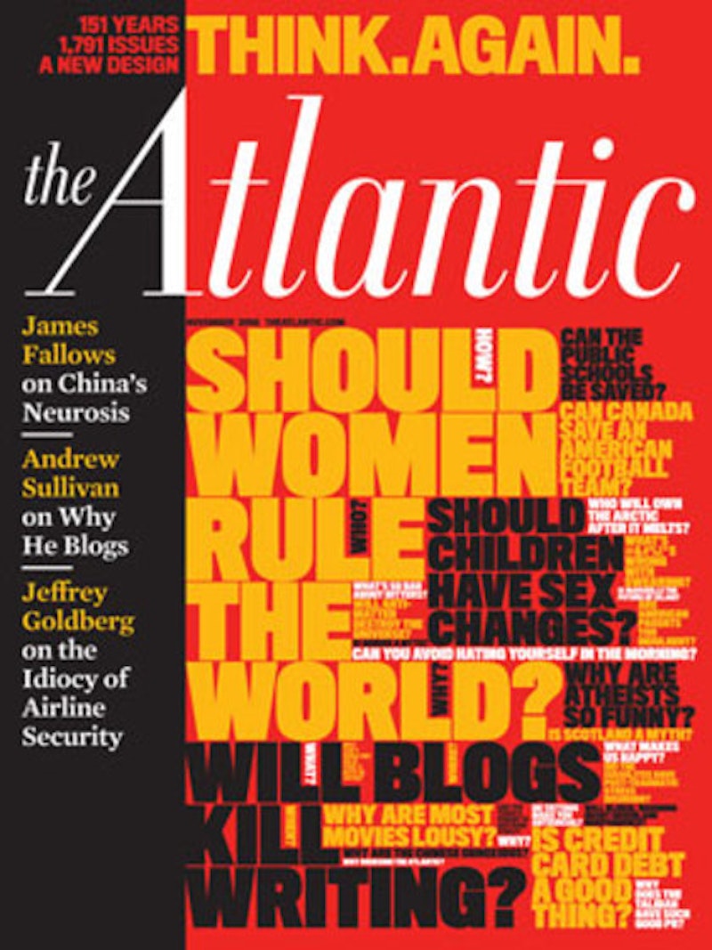
The Atlantic, publishing since 1857, now has a paid circulation in the 400,000 range, a number that’s bound to drop in coming years for the obvious industry-wide reasons and nothing to do with the still, in general, high-quality content. (Andrew Sullivan is just an awful regular at the magazine, but that’s okay with me, so long as Gregg Easterbrook and Virginia Postrel are kept on.) So, you’d think that the editors and business managers of the magazine, when considering a re-design, would want to make their product stand out at the newsstand and in the mailboxes of subscribers. I’m one of the latter, still a holdout for some print publications (a combination of habit, cheap re-up cost, and the preference of holding a physical copy while reading before going to sleep rather than a laptop) and when The Atlantic arrived last Saturday I was actually quite appalled. As you can see below—although this doesn’t do justice to the real thing—the cover is a mish-mosh of headlines, with the kookiest bunch of all-type teasers I’ve ever seen. I gave up and went straight inside, although I did admire the revival of the elegant logo of the magazine from decades ago.

Whenever a publication is re-designed it falls upon the editor to explain the changes to wary readers and almost always the result is a bunch of baloney—10 years ago, the stock phrase was “reader-friendly”—and James Bennet is no exception. My favorite, and impossibly pretentious, excerpt is: “We’ve been guided in this redesign by the belief that in these days—these days of Chinese momentum [the perils of leadtime] and American uncertainty, of warming seas and Twittered lives, of handheld miracles, pious killers, oracular genetics, and reborn political passions—a magazine about ideas that matter can be useful to those who want to understand what’s happening, and maybe to do something about it.”
I want to understand why Bennet and his design team completely messed up their cover; my understanding of “what’s happening” is covered, thanks very much.