
After work last week, I went over to the Transit Museum annex in Grand Central Terminal (say “Grand Central Station” and purists get apoplectic) to look at some subway signage. I’ve been a member of the Transit Museum for several years now, duly sending in my annual $60 fee. The Museum was set up in a decommissioned IND station in downtown Brooklyn in 1976 as a temporary exhibit, a way to show off some historical rolling stock no longer in use. It’s expanded into both a permanent museum and a learning space with workshops in transit history-related topics for adults and kids alike, through ever-changing exhibits, but the core of the museum lies in the basement tracks where the old subway cars going back to 1912 reside. An annex was set up in GCT several years ago, with exhibits different from those in downtown Brooklyn in a much smaller space.
I’m not quite the “foamer” that some enthusiasts are, but I do savor it when, say, I get on an older subway car—the A, C and J lines, there are cars built in 1964 still running, and cars from the 1970s can still be found on the A, F, J and R lines. Unlike many, I have a fascination for subway station architecture and signage. The subways have gone through waves of different architectural styles, beginning in 1904 when architects Heins and LaFarge designed stations with an ornate, Beaux Arts esthetic; this was followed by the back to basics “Arts & Crafts” stations built from 1911 through 1928, heavy on tiling and mosaics. From 1933-1950, new stations were all built to a seemingly prefabricated Moderne theme, with minimal orientation. By the 1950s, all these styles were intermingling and the subways had also grown so complicated that even native New Yorkers were getting lost. In 1967, Unimark, a design firm founded by Massimo Vignelli and Bob Noorda, was hired to standardize subway signage, and their basic designs are still used today.
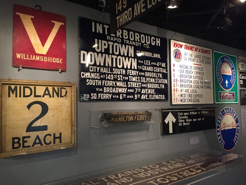
Above is a wall mural with signs from several decades. The big “V” sign was used on Bronx streetcar lines, which were identified by latter as many subway lines are today. The Midland Beach sign was used at the St. George Ferry terminal in Staten Island to identify a bus line; today, many Staten Island bus routes still emanate from the ferry. The big blue sign illustrates the sort of confusion that Unimark was hired to sift through; today’s subway signs identify lines by number or letter, and the signs are short and to the point.
Subway identifications evolve, and letter and number identifications come and go. The sign in the rear points to QB, QT, T and TT trains that no longer exist; they have been confined with other routes, and today, lettered lines are identified by a single letter only.

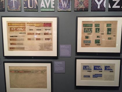
Designer Graham Clifford here illustrates that even in the subways’ early days, there were enough tiled mosaics so that every letter of the alphabet appeared on one sign or another.

Grand Central Terminal has an entrance at the Graybar Building, which fronts on Lexington Ave. and E. 43rd St. The Graybar was originally named the Eastern Offices Building. It was designed by the architectural firm of Sloan and Robertson and opened in 1927, at the height of the Art Deco period, and the building was designed with a lighthearted feel: an entrance canopy on Lexington features wrought-iron rats scampering up the supports, as rats used to board ships by scampering up ropes.
The entrance subway sign was fanciful too, with stylized metal sea horses flanking the illuminated sign. This sign was in place from the 1910s into the 1990s, when it was preserved in the Museum.

A collection of signs that were in use until fairly recently. The “Track 3” sign was in the Flatbush Ave. Long Island Rail Road station before its early-21st Century renovation. The green and yellow globes were adopted by the MTA in the early-1980s as a means of telling the public what station entrances were open and when: red globes were exits only; green meant open 24/7, with a token seller; and yellow meant a turnstile entrance only. The adoption of the MetroCard prompted the MTA to discontinue the yellow globes.

Today, all identification and destination markers at the front of MTA buses are electronic displays, but until the 1980s, roll signs like these were operated by the driver. After plain black and white for many years, a red and blue scheme was adopted, with the Helvetica font employed by Unimark as its principal type style.

How in the world was this oddly-shaped parallelogram used for subway signage? The answer is simple. It was deployed on entrance staircases to elevated lines, where it would best fit and a type size large enough to be easily read. This sign also exhibits the kind of verbal clutter that Unimark was hired to amend. NYC has thousands of immigrants, for some of which English is not a first language. Simplicity was first and foremost in Unimark’s task.
Though there are two branches of the Transit Museum, subway stations themselves are mini-museums, preserving many elements and styles from previous decades. The Independent Subway was constructed by the city, mostly underground, between the years 1925 and 1950, and the subways’ chief designer of the time, Squire Vickers, originally a painter, devised a Modernist scheme for the stations: each would have short, simple signs with huge lettering, and bear one main color. To today’s riders, the colors of these IND stations would seem to be random or haphazard. Not quite true: there’s a method. Along each line, local stations all have the same color, which changes at express stations. Every station has purple tiling on the Queens Boulevard line between Queens Plaza and Roosevelt Ave., then blue between Roosevelt and Continental Aves., etc. This was done as a means, again, of letting people who did not necessarily read English to know where they were on the line.

When Unimark first began creating the subways’ modern signage scheme in the early-1970s, they decided to employ a simple, easily readable font that would appear on black on white signage. Their first choice was Helvetica, developed in Switzerland in the late 1950s. Unimark, however, was unable to obtain the rights to the font for several early years, and thus, settled on a similar font called Standard, developed in Germany as Akzidenz-Grotesk; Germany pioneered sanserif fonts previously with Erbar and Futura. Thus, early signs appeared in Standard, and some of these can still be seen here and there, but since the 1980s all new signs have been set in Helvetica. The main difference in the Unimark signs in the 1970s and today’s has been that the background has been flipped to black and the type is white.
—Kevin Walsh is the webmaster of the award-winning website Forgotten NY, and the author of the books Forgotten New York (HarperCollins, 2006) and also, with the Greater Astoria Historical Society, Forgotten Queens (Arcadia, 2013)