
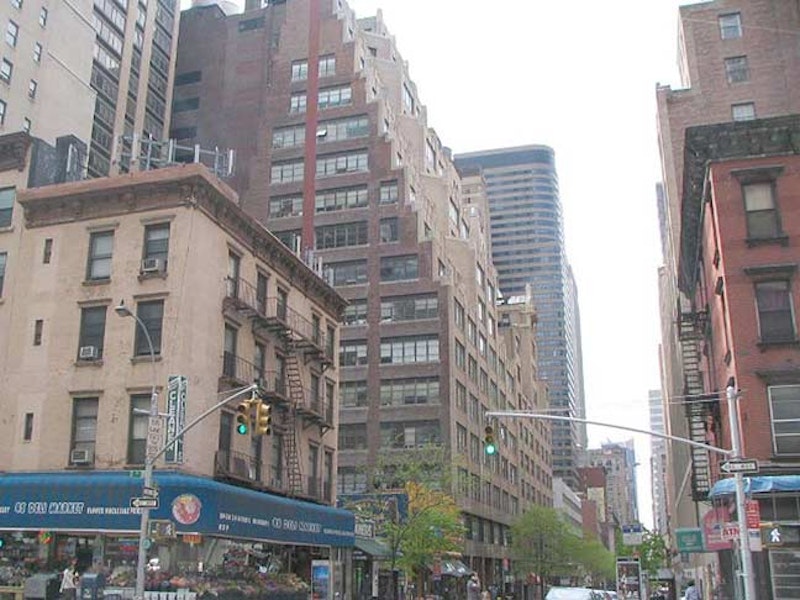
216 East 45th Street, in the ziggurated building shown in the above photo, was a pivotal location in my life when I was a young man.
People who have followed my website, Forgotten-ny.com, over the years know by now that I’m a type fanatic. I have been ever since I got involved with my college newspaper. At the beginning of each year we chose what the look of the paper would be, what fonts, or typefaces, we would use for our headlines and text. In the Super Seventies, and for decades after that, typesetting was much more a craft than it is now, when a computer makes all the typefitting adjustments with ease. By the time I entered the business, the process had simplified to a photographic process but from the Gutenberg days of the 1500s on into the late 1800s, the process of making and setting type was heavily industrial, yet called for a skilled eye and a steady hand, as small pieces of molten metal were poured into casts, hardened, stamped in ink, and pressed on paper (and that’s simplifying things a great deal).
Some of our commonest everyday expressions go back to the typesetting process. Pieces of type (individual letters by different sizes and fonts) were stored in wood trays in old type shops. If they got out of order, they were said to be “out of sorts.” The space between lines of copy to this day is called leading, even though small pieces of lead of various thicknesses are no longer inserted between lines of type to make these spaces bigger or smaller.
I suppose I can be nostalgic about anything. One of my first jobs out of school was as a proofreader and typesetter at Photo-Lettering, at the time the country’s biggest type dealer. The company produced advertising for the major advertising firms at the time using the thousands of fonts in its type arsenal. I worked for the better part of a decade between the hours of 5PM and 3AM, and when there was overtime, I would battle the rush hour crowds to go home. It was sometimes boring work that divided incredibly productive and feverish labor with other times when there was nothing to do, the clock moved like molasses, it'd be 1AM and I wondered what I was still doing there.
Changes were afoot that would make Photo-Lettering and its processes irrelevant, however, as the desktop typesetting process, in which everyone is in effect their own typesetter, was on the way. PL sold all of its font collection and was gone in a few years after I left for a daytime job in 1988. Its creative department, though, which boasted the talents of Milton Glaser and Ed Benguiat at various times, continued to design fonts even after the company’s demise. Photo-Lettering is still a revered name in type design and type development.

Photo-Lettering, Inc. was founded by Edward Rondthaler and Harold Horman in 1936, the partners having developed a step and repeat (a reproductive technique) for photographic lettering in Rutherford, New Jersey. Rondthaler (1905-2009) had already begun hobbying in print at age 5, and began the Big-Little Print Shop at age 13, running it from 1918-1924. Decades later, a Photo-Lettering type sample book, the Big Little Book, took its name from this long-ago enterprise.

Above is the cover of the 1981 edition of Rondthaler’s biography, “Life With Letters.” It shows the letterform wallpaper that was used inside PL in the 1950s. From 1953-1966, Photo-Lettering issued a porcelain tile containing two letters of the alphabet at Christmas as keepsakes. The tiles were 5 by 5 checkerboards, each showing a different letter of the alphabet in a different one of PL’s fonts. Two letters—A and B on the first tile released—took up 4 spaces at the top left and top right. The original 1953 tile was in Wedgwood blue, same color as the book cover; the letters on the cover are the same as the ones used on the tiles. I wish I could have obtained one or two of these tiles. I do have a glass mug emblazoned with the Photo-Lettering logo that was given one Christmas, as well as a numbered Ed Benguiat poster showing different parts of letters. (Letters do have parts: serifs, finials, etc.).

While working nights at PL I didn’t get out very much—down the block or around the corner for some fast food for lunch, which I generally ate at 2AM. I would hit the sack as soon as I got home, between 5 and 7AM depending on my shift, and would wake up around 1PM, putter around for a few hours, and commute against the grain to work between 5 and 7PM. When first hired, though, I did days for awhile, walked around, and noted some aspects of the immediate neighborhood that formed lasting impressions.
Dag Hammarskjöld Plaza runs from 2nd Avenue east to 1st Avenue at East 47th Street, constructed by the NYC Parks department shortly after the UN opened on 1st Avenue in stages between 1947-1953. Mostly a concrete plaza with benches, it was named for the second UN Secretary-General, Sweden’s prime minister Hammarskjöld (1905-1961), and re-landscaped with decorative metal structures and new benches in 1997-1999. Unfortunately, the direct view the park had of the famed Long Island City Pepsi-Cola sign is no longer possible after the sign was moved, though you can still see the Zurab Tsereteli statue of St. George slaying the dragon at the very end of the plaza at 1st Avenue.

The 1964 Holy Family Church (315 East 47th facing the plaza) with its white marble exterior, reminds me a great deal of Edward Durell Stone’s 2 Columbus Circle, remodeled in a controversial re-boot in 2007. (The spoon-shaped decorations that gave it the nickname “Lollipop Building” were removed during the remake).
The church was new when it was visited by Pope Paul VI during his NYC tour in the fall of 1965. The pontiff visited the UN, the 1964/1965 World’s Fair, and the ex-Cardinal said Mass before thousands at Yankee Stadium. It was the first time a sitting Pope had ever visited the USA.
The church is backdropped by the 72-story 2001 Trump World Tower (Costas Kondylis, architect). Has “The Donald” ever built an esthetically pleasing building? All of them seem to be about height and imposing power. For about one year, 2001-2002, it was the world’s tallest residential building until surpassed by Tower Palace Three Building G in Seoul, South Korea.

I never (or rarely) ate at the Comfort Diner—in the 1980s called the Jay Dee Coffee Shop—while working at Photo-Lettering, though at 214, Jay Dee was right next to PL at 216. It had “normal” hours and was closed when I went to lunch. I never thought to try it before work, though, and I can’t remember if it had any of those classic diner trappings back then. These may be add-ons, because Jay Dee doesn’t show up on any of my NYC diner sources. This is the only Comfort Diner in operation at present—the West 23rd Street Comfort, just west of 5th Avenue, shut down in early 2009.

My friend Gary, who has since moved to Atlanta, worked across the street from me for a time during my PL employment. Of course he worked daytime hours, but at times we would meet at this now-shuttered Blarney Stone on 3rd between 44th and 45th for a few, him after work, me before. Did I ever go to work with a buzz? Maybe, sometimes, very occasionally. The Blarney Stone chain of dives had been around in NYC for decades, but has dwindled down to a precious few. The chain is named for Ireland’s namesake stone, located at Blarney Castle outside Cork. According to legend, kissing it gives the kisser prodigious persuasive powers.

In the wee hours each morning I would pass the Greybar Building, Lexington Avenue between East 43rd and 44th, with an entrance in Grand Central Terminal. (The terminal closes overnight, so I would use the IRT entrance at 42nd Street to enter the station).
Strange creatures spit out hawsers supporting the canopies protecting people waiting for cabs either side of the main entrance. The hawsers on the main entrance feature rats scrambling on them; the hawsers were meant to evoke a maritime theme, and rats were always trying to board ships in this manner in the days of wind-powered sailing.
Sometimes on the way to work I would pass through the waiting room at Grand Central, tied for NYC’s greatest public space with Rockefeller Center. This was before the Big Cleanup, and the dust and grime on the windows was too thick to allow sunlight.
In 1988, I consulted an agent named Al Smith on 42nd Street, a nice guy who found me work with ANY Phototype, a mainly Russian language type shop on 29th Street ran by 3 proprietors, 2 brothers (initialed A and N) and Yuri Stark. They needed someone to work with English and other languages using the Roman alphabet. I typeset and read work in English, French, German, and even the Swiss dialect called Romansch. I don’t know any other language than English, so I worked character by character. This got me through the next three years before an inevitable economic downturn meant a layoff. That was 1991. Since that time I have worked with the world’s biggest direct marketer and the world’s biggest store, as well as a 13-year part-time stint with a chain of local Queens papers, as well as a temporary stint with Tiffany & Co., of all places.